


As a video production company, we deal in the language of visual content. But a crucial piece of creating effective content is making sure it's accessible for everyone.
Accessible design means that we create products, spaces, or content that can be used and understood by people of all abilities, ensuring equal access and usability for everyone. It aims to remove barriers and provide inclusive experiences, promoting diversity and enhancing usability.
Animation and motion design is an area where this really matters -- choices of colour palettes, text size, contrast, all play a key role in making a piece of content more accessible. It's important to balance these elements along with aesthetic design and client needs when designing content.
Check out Motion Graphic Designer Jonathan Reyes' top four tips for accessible design:

1) Amplify your design foundation
Great animation starts with a solid design foundation. It’s worth putting in the time when developing beautiful style frames, having the added benefit of keeping the client fully aware of what the final product is going to look like. Gorgeous designs are the simplest way to catch the eye of the viewer.
However, good design is not just about aesthetics. It also needs to be functional. Is the text legible enough for the visually impaired? Is there space somewhere on the screen for the option to add hard captions? Are the colour combinations used contrasting enough for someone watching who has a form of colour blindness? I like to use this site as a step towards not using colour combinations that may be difficult to differentiate for some people.
2) Treat motion with intention
This is where animators have the most fun. We can turn static frames into explosive animations and smooth transitions. In an era where short form media rules, it’s important to be captivating from the get go. It is true that the first 10 seconds needs to be engaging. Because of this, we've seen a trend towards fast, flashy content. While all animations are designed for a specific use (e.g. scroll-stopping moments on social), it's important to make sure that it's not just eye-catching, but also digestible. Your info does no good if it flies by without anyone having a chance to read it.
A general rule of thumb I follow is for there to never be a static frame in the video. But, sometimes a shot will need to be held onto for a while, for pacing or legibility. Don't feel like these paced moments breakdown your original pace or vision. These pacing moments can easily be elevated by adding an animated overlay texture, like a grain or noise, or employing a very subtle zoom in/out of the shot, allowing your audience to take in your information while still keeping the pace and tone you intended.
3) Focus on accuracy
Animation is one of the best ways to visually convey information. The visual information depicted can range from highly detailed to just indicative, but at all times it is imperative that it is accurate.
For educational videos, it is a sensible approach to work with academics in the specified fields to ensure all the information is correct. For infographics, I aim to have all depicted data featured on screen to be proportionate with each other. If a map is featured, it is important to ensure disputed territories are handled with care. All of these things are key elements of making content that is accessible and inclusive.
Double checking and verifying the information you're animating is a key element of being a good team-player as well. There's a lot of steps (and people) involved before something might hit my desk, but I always take this opportunity to evaluate each project with a fresh set of eyes, and to be there as a sounding board for my producers and clients.
4) Adopt an inclusivity-first mindset
Animation, at all times, needs to be inclusive. Representation matters and as content creators we have a job to always keep in mind what is depicted on screen is respectful to who will be watching it. A video certainly resonates with me a lot more personally when I see someone who looks like me on screen.
When I feature people in the animation, are they representative of the intended audience, in a respectful manner? Do the characters display diversity? Is the content culturally sensitive?
Finally, the symbols and icons we use to represent ideas matters. On face value they can be harmless, but have subtle connotations and enforce negative stereotypes. What symbol would you use to represent a group of women? What would you use to represent a group of men? Do they infer subtle biases? There’s no simple answer. I love this insightful talk by Cabeza Patata in which they discussed the challenges and biases that come along with trying to design a gender-neutral character.
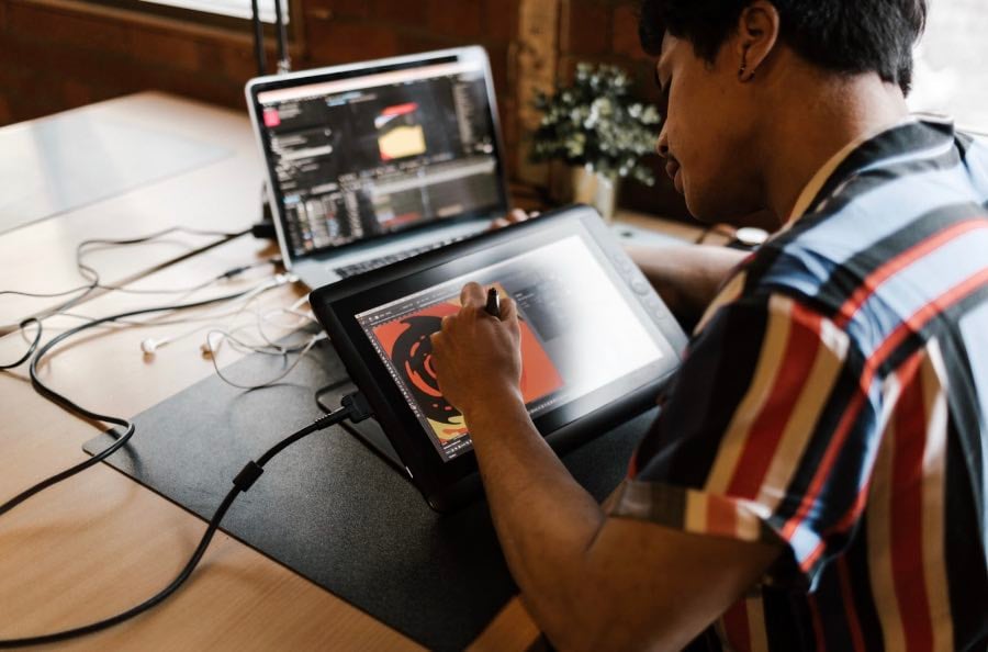
Photo Credits: Jackson Loria
Thoughtful content production is important to us at Casual, and our team of motion graphics designers elevate video to make sure it's accessible, inclusive, and effective.
Jonathan Reyes is an animator, illustrator and motion designer at Casual, based in Australia.
Working with big ticket clients such as Salesforce, Avery Dennison, ABC, Coca-Cola, Tumblr, Slurpee and The National Gallery of Victoria, he leads motion graphic design for Casual's teams. When he's not animating, you can find Jono outdoors - hiking, camping or rock-climbing out in the wild.
.svg)
